Sample Graphs
(Your numbers may be very different but the shapes need
to be similar)
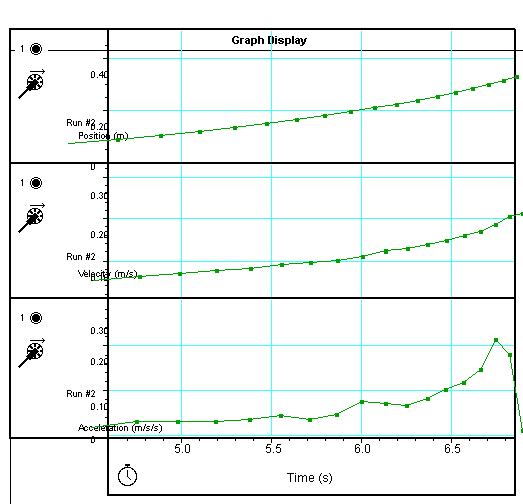
Your distance vs. time graph must be curving up.
Your velocity vs. time graph must also have a slight upward curve.
Your acceleration vs. time graph is the most difficult and the one that will drive you crazy. (One way to get a better looking graph is to increase dramatically the time intervals at which the data is taken. I would recommend 200-500 Hz, thereby assuring yourself of a better graph from which to integrate). Ideally your graph should be a sloping straight line. However, as the graph above illustrates, you may get a curved graph, which will still work and which you can use to introduce the concept of jerk.